Anatomy of a BG: Part 1
Keep your eyes peeled for our new Esurance commercial on tv. It's called "Lost Reel" and it's definitely one of our favorites to date (I think whichever one we're working on usually is).


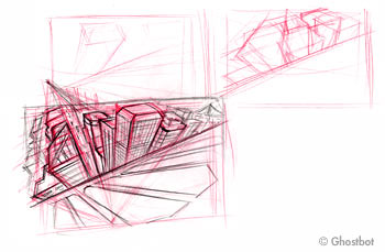
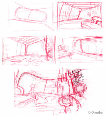
Here are some rough thumbnails I sketched to try and figure out basic composition for two money shots - the opening city shot and the main interior shot. For reference I was looking at the almighty Blade Runner and photos of cheesy, retro, bachelor pads ("Yeah, bay-beeee!"). I'll post up the next stage soon...


3 Comments:
Nice work! I always have a tough time creating interesting backgrounds. Do you have any tips to share? Theories?
Thanks, Marmax! The ironic thing is I never used to appreciate backgrounds before so it's funny that you're asking me this question. But here goes...
I think the main thing I try to focus on when I design backgrounds is composition. That's why sketching thumbnails is helpful because you don't get bogged down on details or "style" since you're drawing so small. That stuff can come later once you have the simple shapes worked out. Some basic questions I ask myself: What is the purpose of the scene and how can the background support that? Where do you want to lead the eye? How can I add contrast to my design (negative vs positive, symmetry vs asymmetry, detail vs simplicity, color vs. black/white, etc.)? Then on top of all that, reference, reference, reference, and...reference.
Dang! Sounds too complicated...
Post a Comment
<< Home